Record🤔
cid:
"bafyreici5pe25jqtbarb3sk6lyoagxsqa65mxkkhqxe4vau6hyqi2yqk2y"
value:
text:
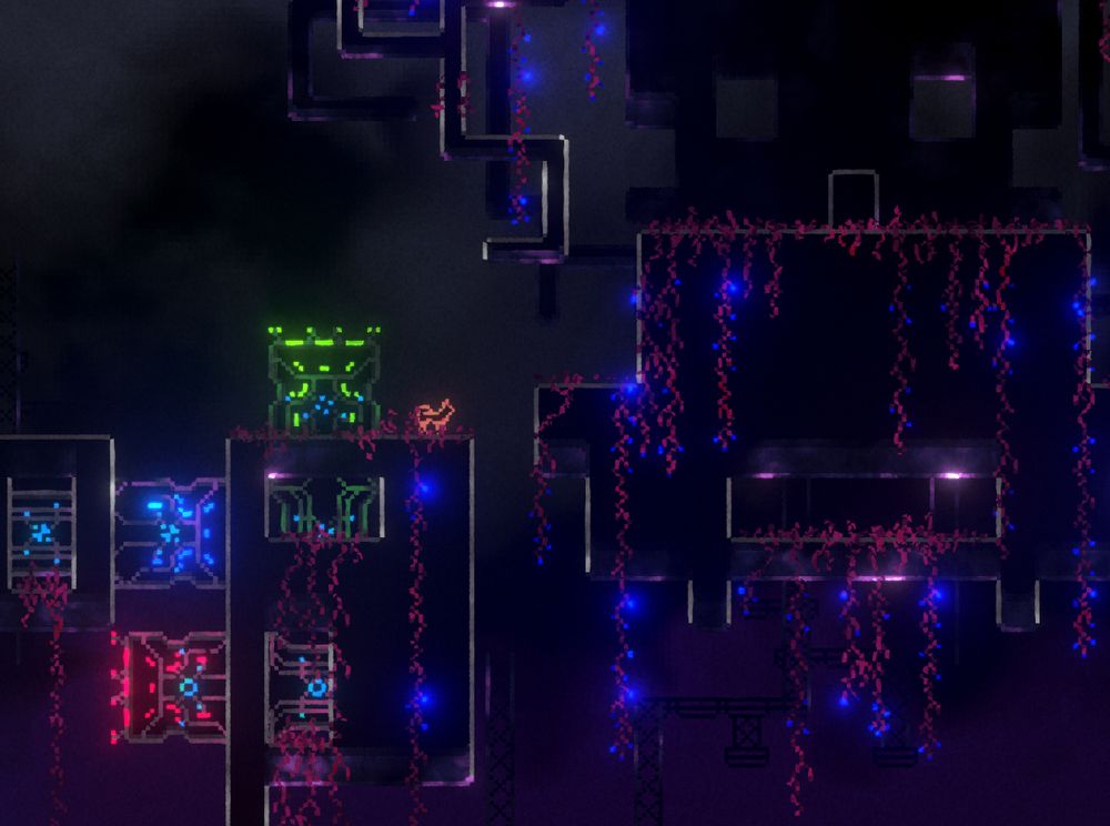
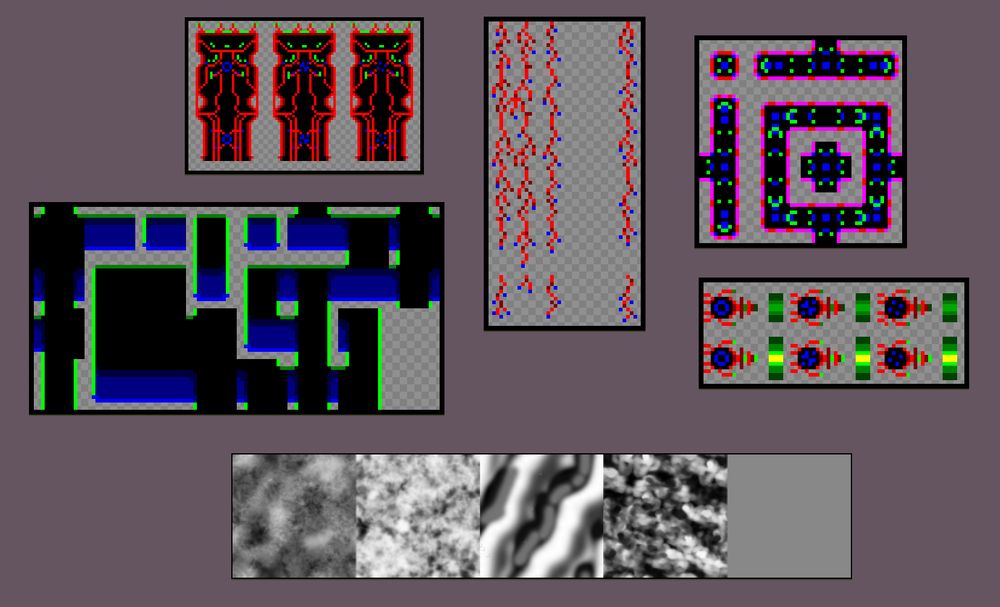
"I have a tendency to view textures as data rather than graphics, especially the color channels which has absolutely nothing to do with what colors actually gets displayed on the screen

Here's a "game vs actual textures" comparison"
$type:
"app.bsky.feed.post"
embed:
$type:
"app.bsky.embed.images"
images:
alt:
"A dog in a 2D platformer world, with metallic structures overgrown with vines with glowing berries. Platforms with glowing high-tech LEDs of different colors are visible. Has a dark and moody atmosphere"
image:
View blob content
$type:
"blob"
mimeType:
"image/jpeg"
size:
936486
aspectRatio:
width:
1088
height:
810
alt:
"Pictures of the textures used for the platforms and objects in the game. They're all in primary colors, mostly red, green, and blue and doesn't resemble the game screenshot much except the basic shapes"
image:
View blob content
$type:
"blob"
mimeType:
"image/jpeg"
size:
851737
aspectRatio:
width:
1656
height:
1006
langs:
"en"
createdAt:
"2024-09-10T05:11:11.297Z"